The problem with memory-based wall art is not that the idea is too emotional. It is that most people describe the feeling and skip the visual reality. The result is usually either bland, overloaded, or painfully cheesy.
Short version: a strong memory prompt is not "make this meaningful." It is a clear art direction built from a real place, a real point of view, and a few concrete details that actually look good on a wall.
If you have ever thought, "I want this to remind me of that trip, that person, that summer, that apartment, that exact evening," but had no idea how to turn that into wall-worthy art, this is the part that matters.
Intro: The Real Problem With Memory-Based Art
Quick takeaway: memory is emotional, but art has to be visual.
Most weak memory-based art starts from a sentence like "I want something that reminds me of my grandmother" or "I want our honeymoon as a print."
That may be emotionally true. It is not visually useful.
A wall piece needs shape, light, composition, color, texture, and restraint. Your memory may contain all of that, but if you only describe the emotion, the output has to guess. That is when you get generic sunsets, fake romance, glowing nostalgia fog, or random "pretty" imagery that has nothing to do with the real memory.
The good news is that you do not need to become a designer. You just need to translate the memory into visual ingredients.
Why These Ideas Often Become Cheesy
Quick takeaway: cheesy memory art usually fails for one of five reasons.
- It describes a feeling instead of a scene.
- It over-explains the backstory.
- It piles on cliché symbols like hearts, silhouettes, fireworks, rose petals, or glowing sunsets.
- It tries to include every detail from the memory instead of choosing the few that matter visually.
- It defaults to generic "AI pretty" styling instead of an intentional artistic direction.
People often assume that the more personal details they cram in, the more meaningful the result will feel. Usually the opposite happens. The image gets crowded, obvious, and emotionally loud in a way that looks awkward once printed.
Tasteful memory-inspired art does not scream the meaning. It lets the meaning sit underneath the image.
How to Turn a Memory Into Visual Ingredients
Quick takeaway: pull the memory apart before you turn it into art.
Instead of asking, "How do I describe this whole moment?" ask, "What did this moment actually look and feel like?"
Use these nine lenses:
- Place: Where are you, exactly? A narrow Lisbon street, a ferry deck at dusk, a tiled kitchen, a train platform, a beach road, a winter cabin.
- Time of day: Early blue hour, flat noon light, golden late afternoon, rainy evening, night lit by streetlamps.
- Season: Dry summer heat, wet October leaves, sharp winter air, dusty August, early spring haze.
- Colors: Faded terracotta, sodium-lamp amber, washed denim blue, pale concrete, dark green glass.
- Mood: Quiet, electric, awkward, warm, suspended, lonely, relieved, playful.
- Objects: Motel sign, paper cup, old tram wire, striped parasol, half-open shutters, chipped tiles, plastic beach chair.
- Point of view: Looking out a window, seated across a table, standing on a corner, from the back seat, from a balcony, from the waterline.
- Texture: Sun-bleached fabric, wet pavement, grainy air, matte plaster wall, cracked leather, sea mist.
- Emotional tone: Not the whole life story. Just the tone the image should carry: restrained tenderness, bittersweet calm, nervous excitement, dry humor, soft melancholy.
Notice what is happening here: you are not writing a diary entry. You are art-directing a scene.
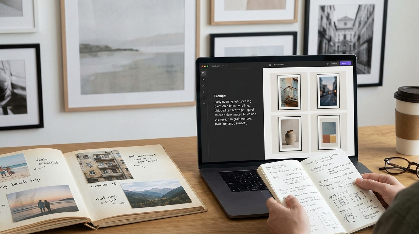
Weak memory idea: "The summer I fell in love in Italy."
Usable visual direction: "Early evening in a narrow Italian street in late summer, warm stone walls, laundry above, fading terracotta and olive tones, seen from a shaded cafe table, quiet and intimate rather than romanticized."
That is the shift you want.
How to Choose the Right Artistic Direction
Quick takeaway: the memory gives you the subject, but the style decides whether it lands with taste.
Different memories want different visual treatment.
- Minimalist: Best when the memory is small, quiet, and object-based. A hallway light, a chair by a window, a station platform. Good for subtle emotional weight.
- Cinematic: Best for atmosphere, travel, movement, weather, night scenes, and emotionally charged locations. Good when light matters.
- Abstract: Best when the memory is more emotional than literal. Good for grief, transition, distance, or layered feelings that would look corny if shown directly.
- Vintage poster: Best for places, routes, coastlines, and city-specific memories. Good when you want clarity and design structure without sentimentality.
- Painterly: Best for domestic scenes, landscapes, and memories with softness or texture. Good when realism feels too blunt.
- Architectural: Best when the place itself is the memory. Good for facades, courtyards, stations, hotels, apartment blocks, verandas, and stairwells.
- Soft monochrome: Best for reflective, restrained, or bittersweet memories. Good when color would push the image into fake nostalgia.
- Symbolic: Best in small doses. Good when a single object carries the memory more powerfully than a full literal scene.
Do not force a memory into the wrong style. A loud painterly sunset is wrong for a memory that is really about winter silence in a hospital corridor. A hyper-detailed cinematic scene may be wrong for a memory that is really about one blue chair in your grandfather's kitchen.
If you are using Primpter, this is where it helps to treat the prompt like a creative brief, not a confession. The better your direction, the more likely the final wall piece will feel like art instead of therapy homework.
10 Rewrite Examples: Weak Idea - Better Direction
Quick takeaway: the goal is not more words. It is better words.
1. Weak: "A memory of my childhood home."
Better: "Late afternoon light in a modest suburban kitchen, pale wood cabinets, patterned linoleum, a bowl of oranges on the table, seen from doorway height, warm but unsentimental."
2. Weak: "The beach trip my partner and I took."
Better: "Windy off-season beach promenade at dusk, empty chairs, cold pastel sky, washed blue-grey tones, seen from slightly behind as if walking back to the hotel, quiet and intimate."
3. Weak: "My grandmother's garden."
Better: "Overgrown summer garden with faded rose heads, chipped green gate, damp stone path, soft morning haze, painterly rather than cute, rich greens and muted pinks."
4. Weak: "The city where we met."
Better: "Rainy tram stop at blue hour in a European city, reflective pavement, overhead wires, one glowing cafe corner, cinematic framing, restrained romance, no people centered."
5. Weak: "A memory of my dad fixing things in the garage."
Better: "Garage workbench under fluorescent light, worn tools, oil stains, dusty shelves, muted industrial colors, architectural composition, affectionate but not sentimental."
6. Weak: "Our honeymoon in Japan."
Better: "Night street in Kyoto after rain, glowing paper lanterns reflected on wet stone, narrow vertical framing, deep indigo and amber, cinematic and restrained."
7. Weak: "The apartment where I lived in my twenties."
Better: "Small city apartment window at 7 a.m., thin curtains moving, rooftops outside, unfinished coffee on the sill, muted plaster walls, soft monochrome with one dusty blue accent."
8. Weak: "The night my friends and I stayed out until sunrise."
Better: "Empty convenience store parking lot just before sunrise, pale pink sky, streetlight still on, paper cups on a car roof, wide composition, nostalgic without glamour."
9. Weak: "A memory of my mother's handwriting."
Better: "Minimal still life with an opened letter, cream paper, dark wood table, soft side light, shallow shadows, quiet and restrained, more about presence than text."
10. Weak: "The mountain trip that changed my life."
Better: "Cold mountain road lookout at early morning, thin mist, slate rock, faded green pines, distant valley, subdued palette, contemplative rather than epic."
11. Weak: "The feeling of my first apartment after the breakup."
Better: "Sparse rented room in late winter, radiator heat, one chair near the window, pale grey afternoon light, soft monochrome, calm but slightly hollow."
12. Weak: "My kid's first summer."
Better: "Back garden sprinkler in hard July sun, striped towel on grass, white plastic chair, bright but slightly faded colors, seen from adult eye level, lively without becoming saccharine."
What Makes Memory-Inspired Art Feel Tasteful Instead of Cheesy
Quick takeaway: restraint is usually what makes it feel expensive, personal, and real.
- Choose one emotional tone, not five.
- Let the place or object carry meaning instead of spelling it out.
- Use color with discipline.
- Prefer implication over obvious symbolism.
- Leave some space in the composition.
- Pick details that are visually specific, not emotionally loud.
The tasteful version usually trusts the viewer more. It does not beg to be understood. It just knows what it is.
What to Avoid
Quick takeaway: most bad memory art is trying too hard.
- Over-explaining: long emotional backstories usually weaken the visual result.
- Cliche symbolism: hearts, butterflies, doves, clocks, glowing skies, and endless rose petals rarely help.
- Too many details: if everything matters, nothing stands out.
- Forced romance: not every meaningful memory needs golden light and soft-focus longing.
- Fake nostalgia: sepia and film grain are not substitutes for real atmosphere.
- Generic "AI pretty" visuals: glossy sunsets, perfect faces, dramatic fantasy lighting, and polished emptiness usually kill the memory.
If a memory matters, do not decorate it to death.
Quick Checklist Before Generating or Ordering
Before you submit your prompt, check this list:
- Did I describe a scene, not just an emotion?
- Did I name the place clearly?
- Did I choose a time of day and season?
- Did I pick a restrained color palette?
- Did I include one or two strong objects or textures?
- Did I choose a point of view?
- Did I decide on a style that matches the memory?
- Did I remove any cliche symbolism?
- Did I keep the emotional tone specific but understated?
- Would this still look good on a wall if no one knew the backstory?
Conclusion
The best memory-inspired wall art does not try to recreate your whole life in one frame. It chooses the part that can actually carry visual weight.
If you want the result to feel meaningful, do not chase sentiment. Chase clarity.
Find the place. Find the light. Find the texture. Find the one angle that still feels true.
Then let the image do its job.