The best walls don’t look “decorated.” They look lived-in. They tell a story. Your story. That’s why more people are choosing to create their own art prints instead of buying the same mass-produced posters everyone’s already seen.
In this guide, you’ll learn how to create custom art prints that feel intentional: how to pick a style, choose sizes that fit your space, and avoid the most common print-quality pitfalls.
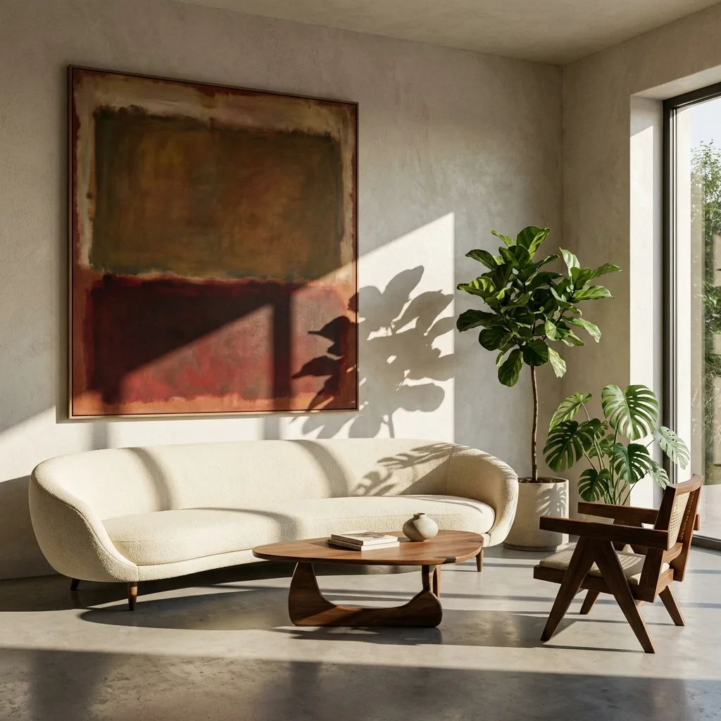
1) Start with a clear intent (not a vague “make it pretty”)
Before you think about paper or frames, decide what the art should do in the room. Is it a calm anchor for a bedroom? A bold conversation piece in a hallway? A personal memory for a living room? The clearer the intent, the more “you” the final piece will feel.
2) Choose an art direction you can describe
When creating personalized art prints, specificity is your friend. Try describing:
- Subject: “a coastal cliff at dusk”
- Mood: “quiet, cinematic, nostalgic”
- Palette: “warm neutrals with a single deep-blue accent”
- Medium: “oil painting”, “watercolor”, “film photograph”, “minimal line art”
3) Pick the right size for your wall (quick rule of thumb)
For most walls, the artwork should cover about 60–75% of the width of the furniture below it (sofas, console tables, beds). If you’re creating custom wall art prints for a narrow space (like a hallway), go taller rather than wider to keep it elegant.
4) Decide between poster, framed print, and canvas
Custom wall art isn’t one format. The right choice depends on the room:
- Art prints (paper): crisp detail and a refined feel
- Framed prints: polished, gallery-like presence
- Canvas: softer texture and bold “statement piece” energy
5) Make it unique: add one personal constraint
If you want unique art prints, add a constraint that only you would choose: an address, a season, a memory, a private symbol, a meaningful color, or a specific place. Generic prompts create generic results. Personal constraints create signature pieces.
6) Avoid the #1 print mistake: weak contrast
Art that looks good on a bright screen can look flat on paper. If your design is very pale or low-contrast, consider adding a slightly darker midtone or a single deep accent color. It improves legibility across the room, especially for custom wall art prints in large spaces.
7) Finish strong: choose a frame style that matches the art
A simple frame can elevate a print more than people expect. Minimal modern frames work well for photography and abstract work. Warmer wood tones complement landscapes and vintage palettes. If you want a clean gallery look, add a white mat.
When you create your own art prints, you're not just choosing a picture. You're choosing a story you’ll see every day.
Ready to turn an idea into something you can hang? Explore styles in our gallery, then create your piece from the homepage generator.